One of the primary defining features of Capture One is the color management architecture. Capture One uses a different color engine than Adobe, and many photographers claim that it is the superior one.
This is an arguable point, but there is no denying that Capture One offers robust tools for enhancing color in your food photography.
I’ve written several general posts about Capture One like here and here, which you may want to refer to if you’re currently a Lightroom user and considering making the switch.
In this and upcoming posts, I’m going to get more into the specifics of Capture One Pro as a tool for food photographers.
Let’s kick off this series by looking at the primary color tools in Capture One and how to get the most out of them.

The Color Tools
There are two primary color tools in Capture One: the Color Editor and the Color Balance tool.
The Color Editor is primarily used to change the appearance of a color. It allows you to select a certain color and work on its lightness, hue, and saturation.
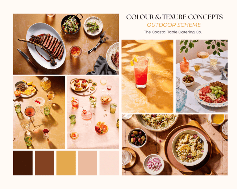
Color Balance is generally more of a creative tool, mainly used for color grading and color correction. For example, I may choose to use the this tool if I want my image to have cooler shadows and warmer highlights–a popular approach in food photography.
The Color Balance tool can also be used to completely change color in an image.

The Basic Color Editor
The Color Editor has three tools: the Basic Color Tool, the Advanced Color Tool, and the Skin Tone tool.
The Skin Tone tool is something you may think of as not useful to you as a food photographer unless you shoot a lot of chef portraits, but it’s actually great for making certain types of adjustments, such as neutralizing multiple colors in the shadows.
The Basic tab consists of eight different pre-defined segments of color. The rainbow segment represents the whole spectrum. The Basic tab works similarly to the HSL panel in Lightroom. You can adjust the hue, saturation and brightness of eight different color ranges.

As mentioned, Lightroom and Capture One’s rendering engines are very different, so if you’re used to setting the sliders at a certain point in in Lightroom, you won’t have the same results with similar adjustments in Capture One. This is most obvious when adjusting brightness levels in Capture One, which is referred to as Lightness. In Lightroom it’s called Luminance.
There are a couple of different ways to work in the Basic Color Editor: you can simply click on the color you want to edit and adjust the sliders. Or you can use the Color Picker to activate the Direct Color Editor. Select a color on your image that you want to edit and then adjust the sliders.
If you drag the picker on the image slightly, a special cursor pops up, which you can drag horizontally or vertically on the image to activate certain sliders.

If you drag it vertically, the Saturation slider will go down. If you drag it horizontally, it adjusts the Hue.
If you hold down >Alt/Opt on your keyboard, you can change the Lightness.
If you click on the two arrows in the bottom of the panel, you can see what this cursor does and set the behaviour for Hue, Saturation and Lightness separately, as well as change the Sensitivity of dragging. This means you can control how broad the cursor movements are.
As you click the picker on different colors, the selected color segment changes; the corresponding square/segment is highlighted.

You can also click on the Edit Color Ranges button at the right end of the color icon row, which is denoted by three dots. This brings up the Direct Color Editor, which allows you to edit colors more selectively by choosing a color range.

The Advanced Color Editor
The Advanced tab in the Color Editor is more precise than the Basic Tool and allows for more control. This is where you can do more critical color edits by selecting a precise color range to adjust.
The Advanced tab is empty when you first bring it up. This is because you need to define the color range that you want to work on. The Basic Tab offers you a pre-determined range, whereas in the Advanced Tab you’re required to select it.

You can affect a larger set of colors and fine-tune color by narrowing or broadening the color range to a higher degree. You can also tweak Hue, Saturation, and Lightness to a larger extent than you can with the Basic Tab.

To select the color range, grab the color picker and click on the photo where you want to work on the color. Capture One will give you a suggested range; the dot in the centre shows you exactly where the color selection has been made from within that range.
Make sure View Selected Color Range is checked off so you can see what part is included in that selection. Otherwise, it can be really difficult to visualize the changes you’re making.

The width of the color range determines what colors will be affected. The depth of the selection controls the saturation range. You can narrow this by hovering your cursor over the edge.
You can affect a larger set of colors and fine-tune color by narrowing or broadening the color range to a higher degree. You can also tweak Hue, Saturation, and Lightness to a larger extent than you can with the Basic Tab.
You can narrow this by hovering your cursor over the edge.
In most cases, you’ll have a small amount of color from a given range spilling into a neighbouring range. This is denoted by the fuzzy boundary on either side of the wedge.
You can expand or contract the selected color segment by moving the handles on the outside border of the color wheel.
To recap how to alter the appearance of a color in the Advanced Color Editor:
• First pick a color with the color picker.
• Make sure the View Selected Color Range icon is on.
• Select the Color range.
• Select the Saturation range.
• Edit the image with the sliders. At this point you can turn off the View Color Range if you prefer, or you can keep it on while you’re working on a certain color range.
• You should also zoom in to see how the adjustment is affecting the photo.
• Go through the same process with each individual color.

The Color Balance Tool
The Color Balance Tool has a couple of applications in Capture One. You can use it for correcting color, or for adding a color grade to an image.
Color Balance allows you to not only tweak color, but add luminosity to the highlights, midtones, and shadows individually.

There are four tabs in Color Balance, which are represented by color wheels. The first color wheel on the left is a Master Wheel. Any adjustments made to this wheel affects the hue of the entire image, so it can be used for adding a color grade or for correcting color casts that cannot be addressed with White Balance.
The Shadow, Midtone, and Highlight tabs will allow you to add color to those specific areas in your photo individually.
For example. if you want to cool down your shadows and warm up your highlights, which is a classic approach often used in cinematic color grading.

The 3-Way tab gives you an overview of the Shadows, Midtone, and Highlight wheels. It has the same functionality as the individual Shadow, Midtone and Highlight wheels, so when you update those, it will be reflected here.
The 3-way wheels are small, so you may find it easier to be precise by using the individual wheels.You can start by clicking on the Master tab and clicking on the wheel to see what works for your photo.

Click on the centerpoint and drag it around the circumference, towards the color you want to affect. Moving the pointer away from the center towards the perimeter increases saturation.
The edge of the wheel is the most saturated point while the centre is the least saturated point. You can fine tune this by grabbing the tab or using your left and right arrow keys on your keyboard.
The curved slider on the left affects the Saturation levels. The curved slider on the right control the Luminosity levels. This is another way you can affect contrast in your photos.
As you drag the slider, the point goes either towards the outer edge or into the centre. You can also use your up and down arrows.
It’s often helpful to start with a high level of saturation so that you can judge the Hue more clearly, then lower the saturation to a more subtle level. You can double-click on the point to re-set it to the centre.
You can adjust the brightness in the Shadow, Midtone and Highlight tab separately with the slider on the right, making the zone either darker or brighter.
The sliders will work even if you haven’t added a hue yet. Getting the color to look just right often requires that you go back and forth between the different tabs to tweak each tint.
Once you have made edits to the Shadows, Midtones and Highlights, you can go back to the Master tab and see if you want to add an overall color grade to the image.
Or you may want to finish with the Master tab to fine tool the overall balance.
The Master tab can give your photo more of a district style, reminiscent of old-school color film, which may be suitable for some photos.
There is no set routine or process you should follow when using the color wheels, but it’s a good idea to start with Shadows, then the Highlights followed by the Midtones.
You can reset all adjustments in the Color Balance tool by clicking on the >Reset icon, but you can also reset the adjustment only in the selected tab by holding down the >Command key (Ctrl on Windows), and clicking on the Reset icon.
The Color Balance tool comes with a list of ready-made presets that can serve as an inspiration or a good starting point. >Click on the hamburger icon in the tool and hover your mouse over each preset to see the effect.
The Color Balance tool is most powerful when you use it on Layers, which will let you alter the opacity and add other edits.
![]()
I hope this post has given you a good sense of how to use the color tools in Capture One and how they can help you take your food photography to the next level.
Want to learn Capture One in depth? Be sure to check out my online Masterclass, Capture One Deep Dive for Food Photography where I take you through my 5-part framework for learning Capture One step-by-step in the most efficient way possible—without overwhelm.

Check out these other posts on Capture One:
Ten Tips for Switching to Capture One Pro
Should You Switch to Capture One Pro?
Getting to Know Capture One