Colors aren’t just visual elements; they hold immense power in evoking emotions, setting moods, and enhancing storytelling in food photography. In this blog post, we’ll dive into the world of color psychology, revealing how different hues can infuse your food photography compositions with captivating narratives and deeper audience connections.

Understanding Color Psychology
Color psychology is the study of how colors affect human emotions and behaviors. In food photography, it’s all about choosing the right colors to convey the desired message and engage your audience. Understanding color psychology allows you to wield the hidden power of colors to transform your food photography into compelling visual narratives that resonate deeply with your viewers.
Let’s explore how you can use the art of color and color psychology to create mouthwatering and emotionally resonant images.
Yellow: Happiness and Optimism
Yellow is the color of sunshine, happiness, and optimism. It can create a warm and inviting atmosphere in your food photos. When photographing breakfast scenes or cheerful desserts like lemon tarts and bright yellow cakes, consider incorporating more yellow elements or using a yellow backdrop in a different tone. It will instantly lift the mood and make your audience feel joyful.

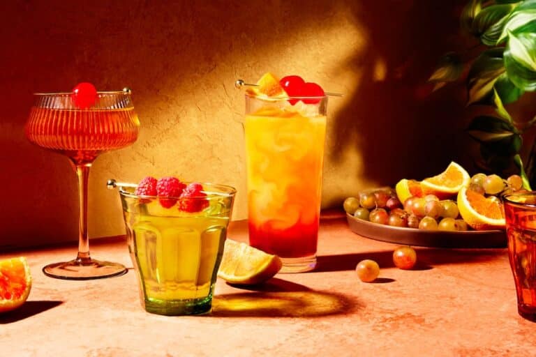
Orange: Energy and Creativity
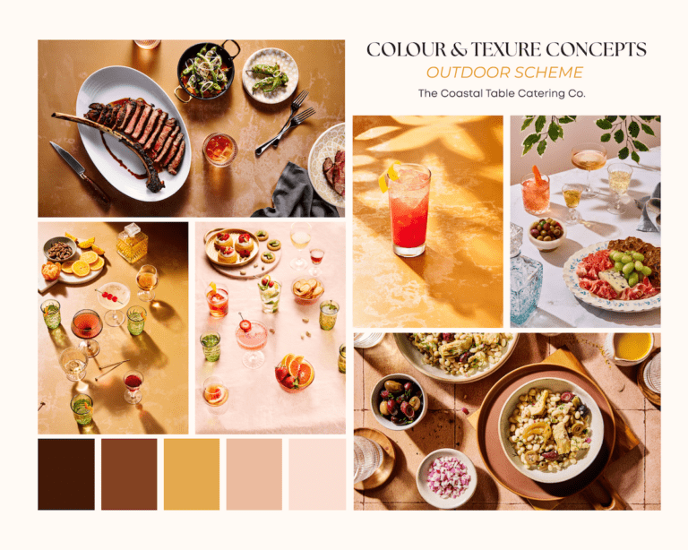
Orange is a high-energy color that exudes creativity and enthusiasm. It can add a lively and dynamic element to your photos. Use orange strategically when photographing vibrant and creative dishes, like innovative cocktails, exotic spices, or artistic plating.
Consider incorporating vibrant orange-hued props like cloth napkins or placemats. For instance, showcasing a table set with cheerful orange napkins beneath a delicious spread of brunch items can evoke an energetic and creative ambiance that complements your food presentation
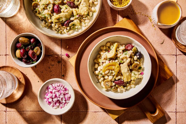
Green: Freshness and Health
Green is synonymous with freshness, health, and nature. When you want to emphasize the natural and healthy aspects of your food, green is your ally. It’s perfect for showcasing salads, fresh herbs, and green smoothies. The color green assures your viewers that what they’re seeing is not only delicious but also good for them.

Red: Passion and Appetite
Red is a vibrant and attention-grabbing color. It’s often associated with passion, energy, and appetite. When used in food photography, red can make your dishes look more appetizing and passionate. Think of succulent strawberries, ripe tomatoes, or a juicy steak cooked to perfection. Adding a touch of red can make your viewers crave the dish.
When used in food photography, red can make your dishes look more appetizing. Imagine photographing a rich and indulgent chocolate cake adorned with fresh red raspberries. The vibrant contrast between the deep chocolate and the bright red berries not only enhances the dessert’s appeal but also evokes a passionate and irresistible craving.
Blue: Calmness and Serenity
Blue is known for its calming and serene qualities. It’s ideal for creating a tranquil atmosphere in your food photography. If you’re capturing dishes that are meant to be enjoyed in a peaceful setting, such as a serene lakeside brunch or a calming cup of tea, blue tones can complement the mood beautifully.
Consider incorporating soft blue hues in the tablecloth or background, enhancing the overall sense of calmness.

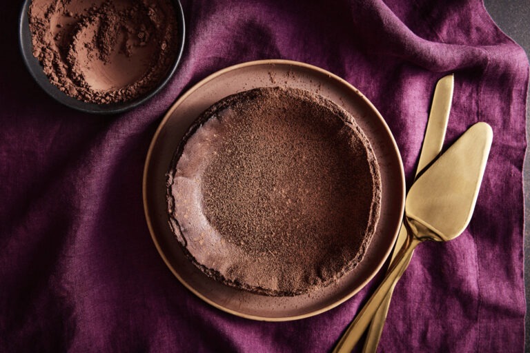
Purple: Luxury and Indulgence
Purple is often associated with luxury, extravagance, and indulgence. Incorporating shades of purple in your food photography can convey a sense of opulence and gourmet quality. For instance, imagine photographing a lavish spread of desserts featuring rich shades of purple in macarons, grapes, or velvety frosting. The royal color adds a touch of grandeur, making your audience feel like they’re indulging in something truly special.
Brown: Comfort and Simplicity
Brown is a comforting and down-to-earth color that brings a sense of simplicity and homeliness to your food compositions. When photographing rustic dishes like a hearty loaf of freshly baked bread, a bowl of oatmeal, or a warm cup of coffee, brown hues can create an inviting ambiance. Utilize wooden backgrounds, earthy tones, or even incorporate brown props like rustic utensils to enhance the sense of comfort and warmth in your photos.

Remember, each color you choose contributes to the visual narrative of your food photography, allowing you to connect with your audience on a profound level. Happy exploring with colors in your culinary creations!
Color Harmony: Creating Emotional Impact
Now that we’ve explored some individual colors and their emotional associations, let’s talk about color harmony. The way colors interact with each other can amplify their emotional impact.
Complementary Colors:
Complementary colors are opposite each other on the color wheel, such as red and green or blue and orange. They create a striking contrast that can make your subject pop. Consider using complementary colors when you want to create visual drama and excitement.

Analogous Colors:
Analogous colors are adjacent to each other on the color wheel, like red, orange, and yellow. They create a harmonious and soothing effect. Analogous color schemes are perfect for conveying warmth and unity in your photos.
Monochromatic Color:
A monochromatic color scheme involves using different shades and tones of a single color. This approach can create a sense of elegance and simplicity. When you want your food to appear sophisticated and refined, monochromatic styling is the way to go.

Here are are some practical tips for integrating color psychology into your food photography:
- Understand Your Dish: Consider the emotions and associations that naturally come with the dish you’re photographing. Highlight and enhance those emotions with appropriate color choices.
- Props and Backgrounds: Pay attention to the colors of your props and backgrounds. They play a crucial role in the overall color scheme of your photo. Use complementary or analogous colors to create harmony and balance.
- Editing Software: In post-processing, you can fine-tune the colors to achieve the desired emotional impact. Adjust the saturation, hue, and luminance to make your colors pop.
- Color Temperature: Don’t forget about the color temperature of your lighting. Warm lighting (more yellow and red) can create a cozy and inviting atmosphere, while cool lighting (more blue) can evoke a sense of freshness and cleanliness.
- Audience and Branding: Consider your target audience and your brand’s identity. Different colors resonate with different demographics and can strengthen your brand’s message.
Incorporating the art of color and color psychology into your food photography is a creative journey that allows you to evoke emotions, tell stories, and connect with your viewers on a deeper level.
As you experiment with colors and their emotional impact, you’ll discover new ways to make your dishes come alive in your photos.