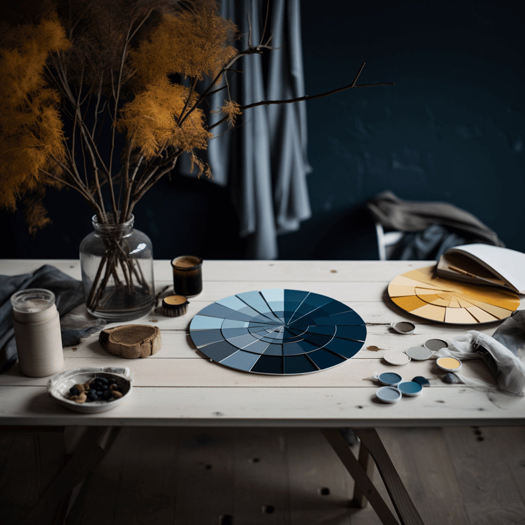
Learning about Colour Theory is an exciting journey that will add a vibrant new dimension to your creative toolkit.
Colours are the foundational ingredients of your artistic endeavours, and colour harmonies as the secret sauce that brings them to life. In this post we’ll explore realm where colours come together in ways that not only please the eye but also evoke emotions and tell the stories that are so integral to captivating food photography.
The Heart of Colour Harmonies:
Think of colour harmonies as the signature flavour of design – they’re what takes your food subjects from good to mouthwatering. Much like composing a symphony, colour harmonies blend different notes (colours) to create a masterpiece. Picture your design as a canvas waiting to be painted, and colour harmonies as the palette that gives life to your vision. Mixed metaphors aside, the trusty colour wheel is your constant companion on this journey.
Exploring the Palette of Harmony:
Colour harmonies are like the seasoning that brings your design to life, using the colour wheel as their playground. These harmonies are the unsung heroes that make designs pleasing to the eye.
You have six key colour harmonies to play with:
- Complementary Colours
- Split Complementary Colours
- Analogous Colours
- Triadic Harmonies
- Tetradic Harmonies
- Monochromatic Harmonies
Complementary Colours:
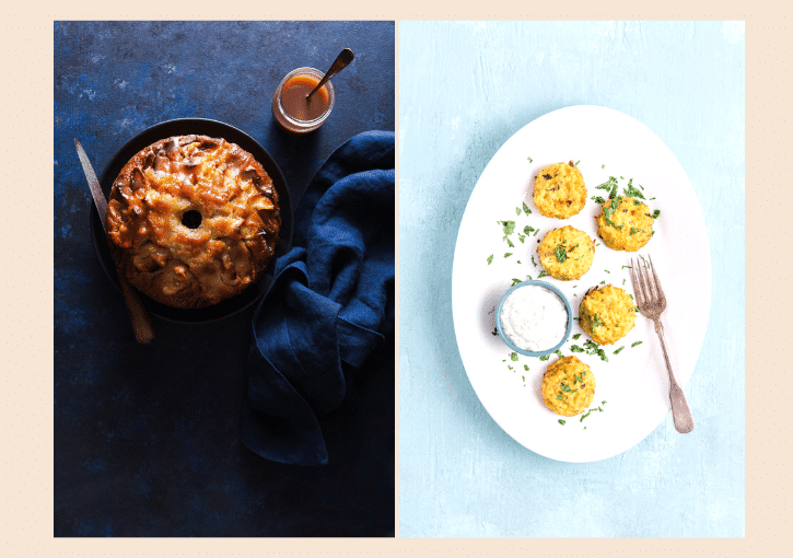
Imagine two colours on opposite sides of the colour wheel – that’s the magic of complementary colours. The intense contrast they create adds a bold, energetic vibe to your design.
But, a word of caution – too much intensity can be overwhelming. If the clash feels like a wild party, consider tempering it with shades or tints. Complementary colours are perfect when you want to make a statement, channel some boldness, or draw eyes to a particular spot.
Split Complementary Colours:
Shaking things up a bit, split complementary colours use two adjacent shades to the opposite hue. This twist maintains the contrast while adding a pinch of subtlety. If you’re new to this colour game, split complementary is your pal. It’s like adding a dash of flair without going overboard.
Analogous Colours:
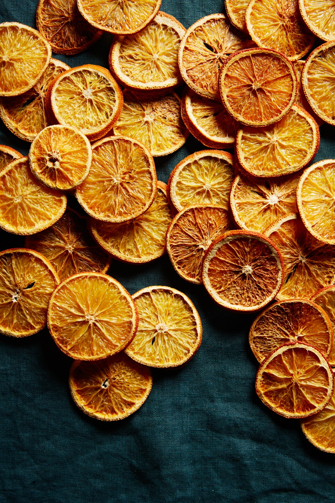
Ever seen colours lounging side by side on the wheel? That’s analogous harmony. It’s all about calm and natural cohesion. If you’re aiming for tranquility or want to bring your design elements into a tight-knit group hug, analogous is your go-to. Choose a star colour and let its neighbours add a dash of flavour. It’s like creating a gradient of colours that blend seamlessly.

Triadic Harmonies:
Three colours evenly spaced on the wheel make up a triadic harmony. It’s like the Goldilocks of colour blends – not too bold, not too subdued. Let one colour take the lead while the others play supporting roles. Tints and shades are your secret weapon here, creating the perfect harmony balance.
Tetradic Harmonies:
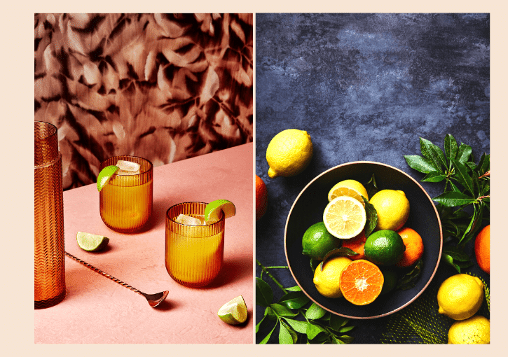
Four colours, forming squares or rectangles on the wheel, create tetradic harmonies. It’s like a colour party with variety. But remember, with great variety comes great responsibility – maintaining balance is key. Strong colours need softer accents, and a mix of warm and cool hues ensures harmony without overloading your design.
Monochromatic Harmonies:
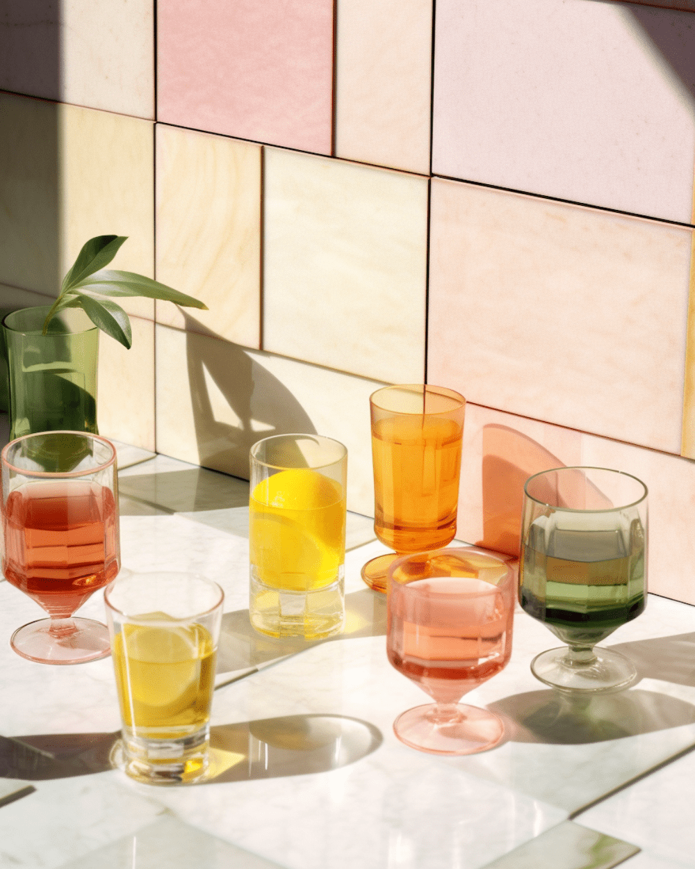
Think of monochromatic harmonies as different shades of a single colour. It’s like exploring the many sides of a character. This harmony brings serenity and simplicity to the table. But, make sure the differences between light and dark shades are distinct enough to avoid a colour snooze-fest.
Bringing It All Together:
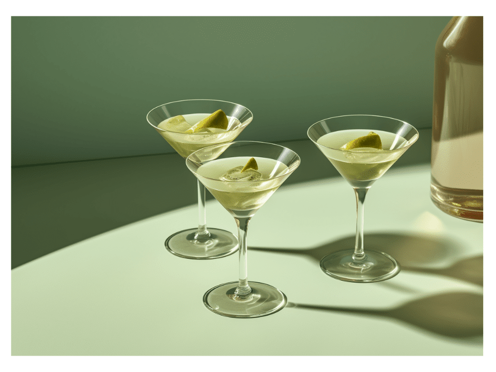
As you journey through the world of colour harmonies, think about this: what emotions are you aiming to evoke? Each harmony has its own unique voice, resonating differently with your audience. Whether you’re going for soothing analogous shades or diving into the high-energy world of complementary colours, colour harmonies will be your guide.
So, embrace the magic of colour harmonies. They’re the key to transforming your designs into mesmerizing stories that leave a mark.
Armed with your colour wheel and these harmonies, your creativity will help you make beautiful food photography that captivates and inspires.
0

