
Food photography is such a challenge because it involves so many moving parts. You have to worry about lighting, composition, exposure, and the technical elements that are necessary to take a good exposure. All the while, the food is dying on the plate.
Each of these factors has the potential to make or break your photo, but composition is the easiest to improve if you know a few basic principles.
When we talk about composition in food photography, we’re talking about the same principles artists have used for centuries. They’re not necessarily hard-and-fast rules, but you’ll notice that whether it’s in art or photography, the creative work that really moves you most likely follows these guiding principles.
Some of these principles are more relevant to one form of media than another. For example, texture is a very important principle in food photography, but not as utilized in some forms of painting.
As a teacher and mentor of photographers, I’ve observed that many new to intermediate shooters don’t take much heed of compositional principles. Meaning, they mostly shoot from intuition rather than study the principles in-depth and apply them to their photography.
I myself did this when I was starting out. It wasn’t until I actually took a class on composition in photography school that I made a conscious effort to familiarize myself well with the principles. The difference it made in my photography was significant, in a short amount of time.
This is not to say I no longer use intuition. I absolutely do. To a certain degree, we all have internalized these principles as an increasingly visual culture. But being aware of them and thinking through my food photography set-ups is what ultimately improved my images very quickly.
Let’s take a look at a handful of these principles and how we might apply them.

The Focal Point
The focal point is a fundamental principle of composition. It’s the primary area of interest in an image. An area that is magnetic to our eye and should fall in a specific area.
If you imagine your frame divided into nine equal parts, like a tic-tac-toe board, you’ll have what we call the “Rule-of-Thirds” grid. Your focal point should fall in one of the four areas where the horizontal and vertical lines meet. The placement doesn’t have to be exact, but close.
The focal point can be made with colour, light, shape etc. You can even place your garnish in your focal point area. In the image of the pomegranate above, my focal point is my spoon.

Line
Line is the most basic element in visual composition.
Lines lead the eye through a photograph to key focal points and elements and keep the viewer’s eye focused on the image. They can be found inherently in food subjects as well as props. These happen naturally, but other lines are created through placement.
There are a couple of things to be aware of when working with lines. When using lines to direct the viewer’s eye, they should point to the main subject, or into the frame.
Lines should also never point outside of the frame, as the eyes will be forced to leave the image. This weakens the image and can cause the viewer to lose interest.
On this note, make sure that your props–like flatware or utensils-don’t point at the viewer. This is incorrect and is considered subliminally threatening!

Repetition
Repeating elements also add interest to an image. Repetition can occur spontaneously in the subject, or can be created by added elements such as props and supporting ingredients.
Sometimes patterns can become monotonous, so breaking up a pattern can create a stronger photograph.
There are various ways to create a break in pattern, such as with a break in color, shape, size, or texture. Where you place this break is crucial; you want to place it in one of your focal points or along intersecting lines.
In this photograph of chestnuts, the open chestnut creates a break in the pattern with colour and lighting.

Proportion & Scale
Proportion and scale are a couple of my most favourite concepts in food photography composition because this is where so many new photographers go wrong but these errors are so easily fixed.
Props have a habit of looking a lot larger to the camera lens than they are in real life. In fact, you don’t really know how big anything is in a given image except in relation to something else in the frame. If your strawberries look tiny because you put them in a huge bowl, that will be the giveaway. Cutlery that is too big next to a small plate will look weird, and a lot of large props won’t even fit in the frame.
In my image of the cookies below, I couldn’t use a regular milk bottle because it wouldn’t fit in my frame. Half of it would be cut off and it would have dwarfed my food subject.
I had to search high and low for a bottle that was small enough. It still doesn’t look that small in relation to the cookies, but the height makes sense to our brain when we view the image.
So the takeaway here is, be mindful of the size of your subject and all the elements in your frame
TIP: Try to have varying heights of your objects in your shots. If the cookies were stacked almost as high as the neck of the bottle, these two elements would be vying for attention.

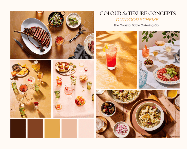
Colour as a Compositional Tool
Colour is an important part of composition. It evokes emotions and creates a sense of mood within an image.
Cool and dark colours such as navy blue and black recede, while light or warm colours like yellow bring objects forward.
Backgrounds and surface colours that are too bright can detract from the subject; they should be chosen with respect to the mood you’re attempting to create, as well as in harmony with your chosen elements.
It is usually best to stick with neutral or cool tones such as blue, grey, brown, black, and white. However, there are times when colours can really enhance a story.

Anything with an orange tone will be magnified by the camera and looks really unappealing next to food. So put away that warm wood cutting board and stick to something more neutral, like a deep espresso tone.
Colour combinations can be monochromatic, when they are tonal variations within a single hue. This approach has its place, but utilizing complementary colours is a particularly wonderful technique to apply to food photography.
Complementary colours appear directly opposite each other on the colour wheel, such as red and green, or blue and orange.
The colour scheme you choose to work with will in part be dictated by the food you’re shooting

Conclusion
Hopefully these tips will help you look at composition in a mindful way. This is just a taste of what there is to know, but if you’re interested in learning more, be sure to check out my eBook Rule-of-Thirds: A Guide to Composition for Food Photography.
It goes into many principles in depth, with examples from my commercial food photography portfolio. It also includes 42 composition templates that you can copy or use as guides or prompts when creating your food photography compositions.


2 Responses
Just loved the way you explained it. Will surely practice in my photography website
http://www.thebambookitchen.online
Love
I’m so glad you found it helpful!