Contrast is an important principle in composition. Generally speaking, our eye tends to go to the area in a picture where the lightest area meets the darkest area. This is referred to as the greatest area of contrast and it applies to photography as well as painting.
When you look at the work of master artists, you’ll notice that a common practice is to place the most relevant subject or element on or near the greatest area of contrast, in order to give it priority.
In the painting below by Johannes Vermeer, the main subject is the seated female. The greatest area of contrast is the white scarf around her head juxtaposed against the teacher’s dark clothing. It is highlighted by the tunnel of light streaming in through the window.

The way that Vermeer captures light in his paintings is stunning, and studying them is a great way to understand contrast.
The greatest area of contrast is a fairly simple concept. Paying attention to this key principle when putting together your compositions has a lot of power to elevate your photos.
Now let’s look at main ways to use contrast in food photography.

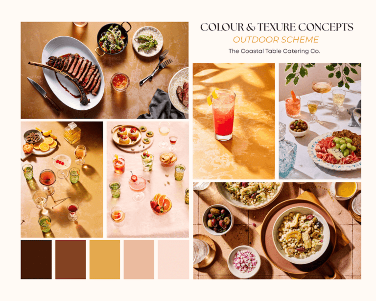
1. Colour Contrast
One of the most significant ways to work with contrast is through the use of color. Color should distinguish the subject from the background, so it doesn’t look like it’s blending in.
One of the most popular colour combinations in food photography is yellow and blue. Most food is warm in tone—especially cooked foods. We can think of these foods as falling somewhere within the yellow and orange tones on the color wheel.
A complementary color is one that falls opposite on the color wheel. In this case, we’re looking at blue. This is why you see a lot of blue backgrounds in food photos. Because they are opposite, they make your food subjects pop. This is a great example of color contrast.
 2. Tonal Contrast
Tonal Contrast is the difference between the light and dark tones in an image. It can sometimes play second fiddle to color contrast in a photo, but there is no doubt that tonal contrast has a significant impact. It is also one way to distinguish the subject from the background. It can help enhance the atmosphere in the photo and create a specific mood.
In the image of the pears below, the tonal contrast and shadows give the feeling of low light and sense of moodiness, although the overall tones of the photo fall somewhere in the middle of the spectrum.

3. Contrasting Textures
Texture is such an important aspect of food photography that I wrote a whole blog post about it, which you can find right here.
However, texture is also an important way to create contrast that tends to get overlooked, as contrast occurs whenever you have two or more visible differences in a photo. Texture helps invoke the senses and a sense of touch to a visual medium.
Most foods have a lot of natural texture, which means that we need to choose props and surfaces that balance texture throughout the photo, as too much texture in these items can detract from the subject and be overwhelming for the viewer.

4. Contrast in Editing
Finally, pay special attention to contrast when editing your food photos. Post-processing is an important part of shaping light.
The bowl of spaghetti puttanesca on the left was shot with a gridded soft box to increase the contrast by narrowing the beam of light coming through the modifier. This created deeper shadows than would occur without the grid, but for full impact, this was augmented in post.
When it comes to editing contrast in your food photos, don’t just crank up the Contrast slider in Lightroom or whatever RAW editor you’re using. Layer in contrast by also adding small adjustments via the different tools that you can use to create contrast, such as the Tone Curve, Clarity, and even Dehaze.
 To Sum Up
Contrast is an important principle of composition. Your overall style may be high contrast like mine, or low contrast, but a successful food photo demands the use of contrast on some level.
One of the best ways to learn about contrast and apply it to your food photography is to study the Old Masters, like Caravaggio and Vermeer. Looking at other food photography can certainly be inspiring, but studying the works of artists outside of the discipline can help you get thinking more creatively and develop your own unique style.
Want to learn more about composition? Rule-of-Thirds: A Guide to Composition for Food Photography is a primer on the basic compositional principles and how they apply to food photography. The Composition Bundle comes with 42 composition overlays you can use during tethered capture to make composing your photos a snap.